Oakwood Knits
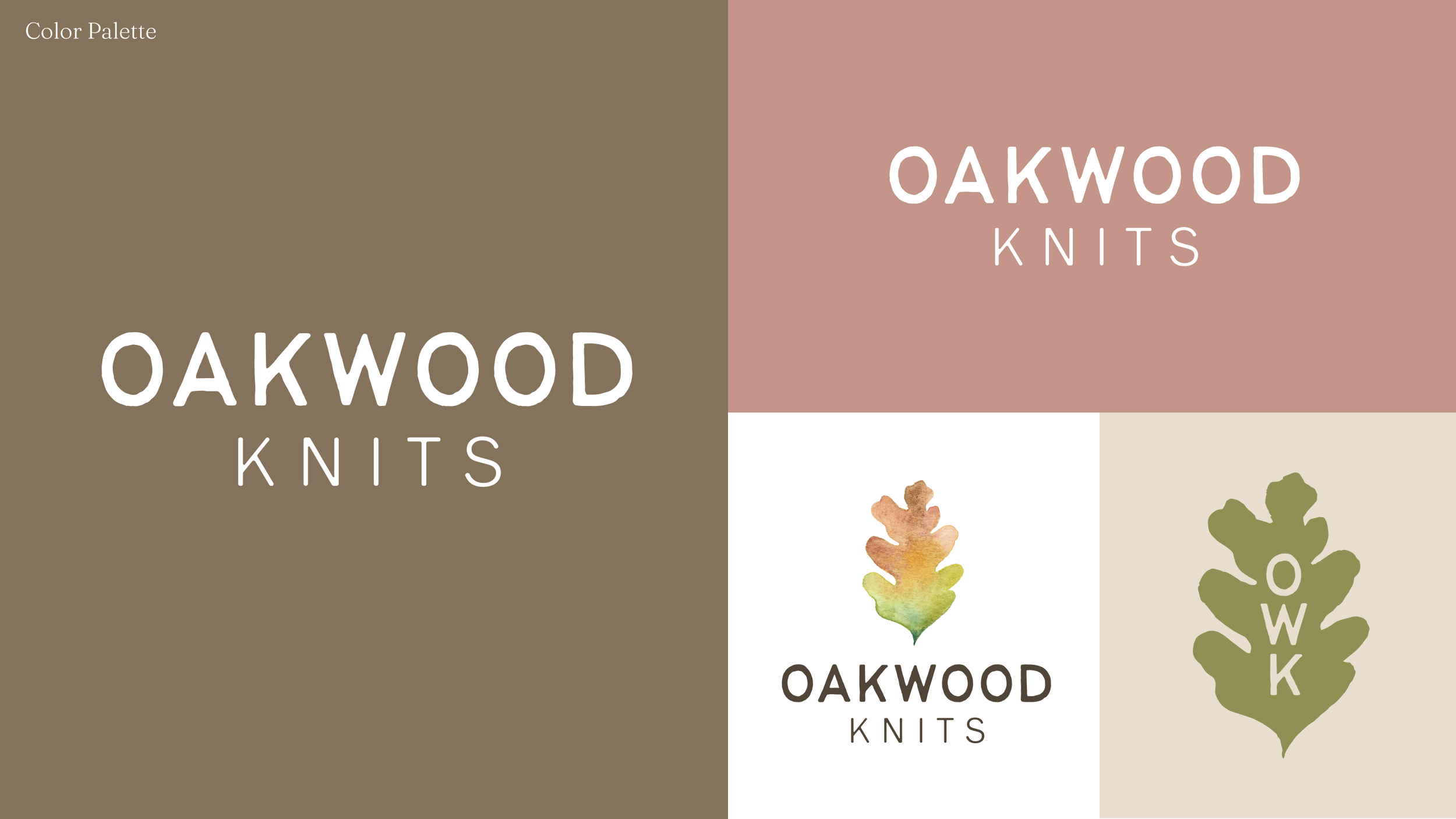
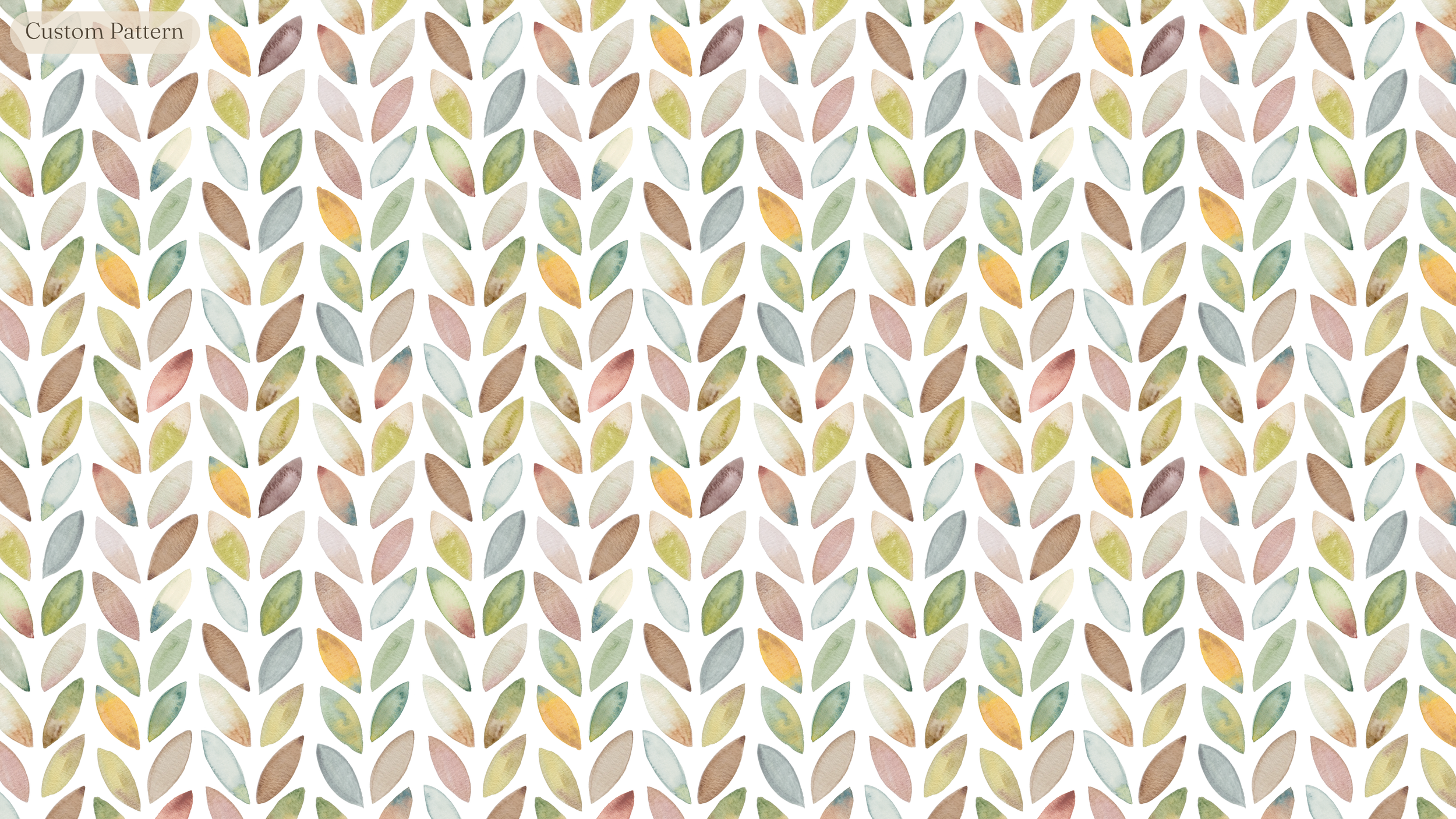
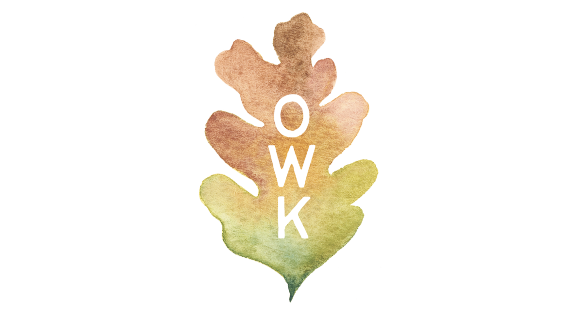
I updated the logo and brand identity for this charming hand-dyed yarn company, which included a refreshed and expanded logo, new color palette, a custom brand pattern, and spot illustrations.
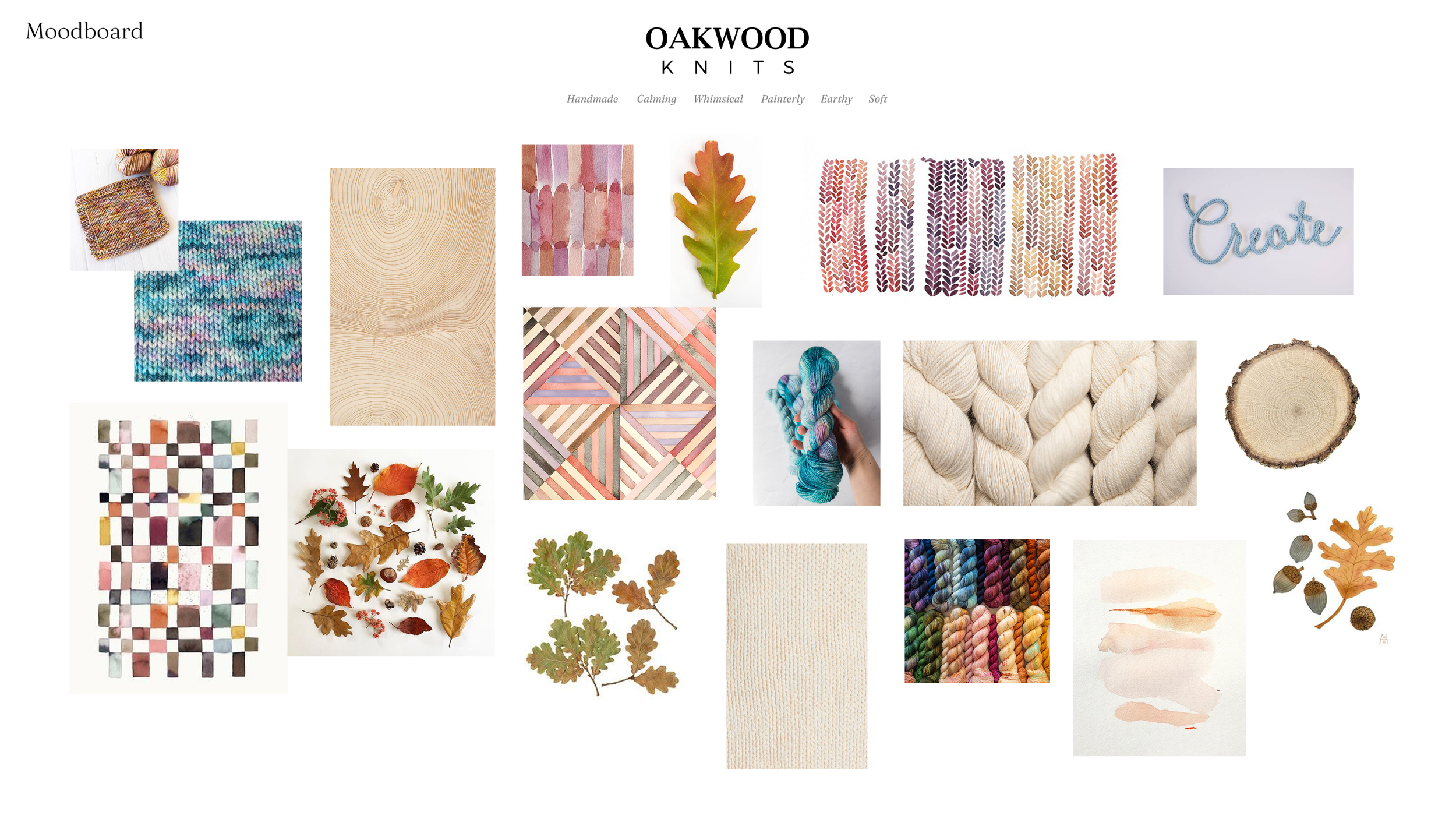
We used watercolor to reflect the painterly aesthetic of OWK’s hand-dyed yarns, and a friendly, hand-drawn typeface to reflect the warmth and comfort of a cozy hobby.
My favorite component of this brand refresh was the hand-painted seamless watercolor pattern we created, which looks both like leaves and woven yarn.
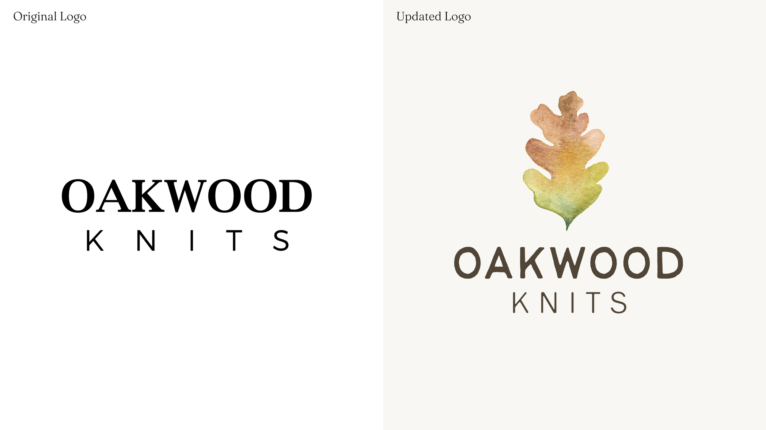
Logo: Wordmark + Icon
There was certainly nothing wrong with the original Oakwood Knits logo, but it didn’t quite capture the spirit of cozy craftsmanship that the yarn brand had come to take on.